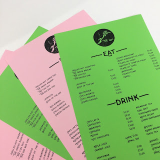
I initially advised the client that a light/pastel green stock would work best for the final printing of the menu. It's an affordable way of adding that bold dash of colour to the design.
But I did some printed experiments on a few different coloured stock types and it looks really bold and interesting on them all! I will now suggest that he could use a variation of colours so everyone within the cafe gets a different colour. It represents the diverse and colourful nature of Hull as a city of culture and community and the bright colours represent the colourfulness you see in a zoo (on the exotic animals and plants).


No comments:
Post a Comment