

These are the final designs composed to print. The poster on the back - created with the purpose of being kept by the audience and hung. The inside content is composed that so each time you unfold a section you are met with a new element of content. The cover, then intro, then main content.
Design in context


The final posterzine has been produced in this case using digital print and in A3 double sided due to print restrictions on a small budget. If this was commercialised I would suggest printing using a litho-printer. Litho printing allows you to use spot colours that are out of the CMYK range - this could open up potential to making the pink even brighter or experimentation with other fluro inks and seeing what is the most effective regarding the audience. This print method would also allow me to print at A2 which was the initial desired format double sided (which cannot be done digital without going to a specialist.

Product, range, distribution.
Product - The product is an informational and inspiring posterzine - designed to incourage a younger generation of people to read philosophy and be interested/inspired in this case by the allegory of the cave - Plato. The poster/zine combination means the audience can pick it up and read it then take it home and keep it hung as a poster - making sure it doesn't just get throw away after use.
Range - This is currently just a conceptual piece of design work so is singular. But if taken further it would work well as a series. One could be published each month giving a well designed and simplified telling of a different philosophical text. The colours could change each time to individualise them all but keeping the format and general layout the same for range consistency.
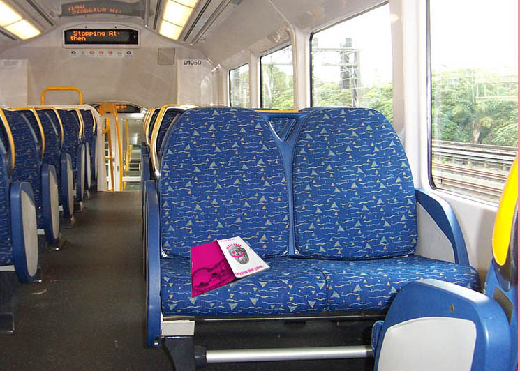
Distribution - The distribution of the zine is something that has been a consideration throughout the design process - it has informed the brightness and boldness in style. I propose that this would be distributed as a free publication. It would appear in shops, trains, buses and places 'out and about'. The overall idea being this is something concise and simple that could be read within about 10 minutes - people would be drawn in by the bold colour and design and read it on their train journey home, then go hang it on a wall.
If you wanted to make the distribution and context more specific - it could be used for part of an immersive advertising campaign. For instance for a philosophy university course and distributed on student bus routes. Or similarly for a TV show, film, web based content on the subject. This plan/design framework could also be adapted for use in other topics of interest depending on demand.

Continuing the concept - the overall style and tone of voice I have created could easily be applied throughout various forms of media. Most specifically web media if it was linked to a web base the simplicity of design would translate well digitally.
No comments:
Post a Comment