
I began by selecting a few different typefaces I felt could work well for this branding. I chose typefaces I felt had real individuality and weren't your everyday standard typeface people see every day. This to me is very characteristic of fine art as a discipline; they aim to produce work never been seen before, push boundaries and break rules. Overall my design needs to reflect this persona.
My typefaces were selected from the Velvetene type foundry who specialise in the kind of typeface that stands out and never fits in with the crowd.

My initial favourite of the typefaces was Sporting Grotesque; a very wide and extravagant typeface but in the simplest of ways. It's quirky but still bold and legible, perfect for getting the right message across.

I began to manipulate the type; letter by letter rather than as a whole as I wanted each letter to have its own individuality and be informed by the underlying concept of 'being different'. Not just from the world but quite simply to express that fine art LCA are different from other graduates and the best in the field.


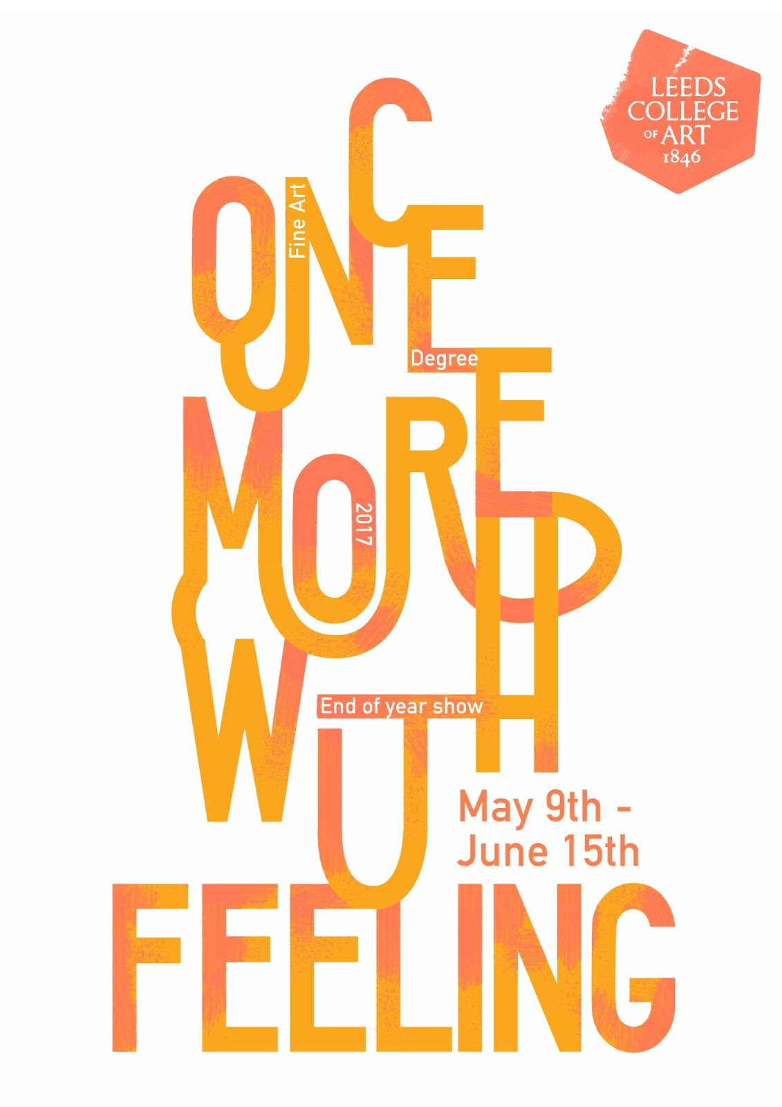


I experimented with different typographic compositions that I felt represented the rebellious nature of fine art as a discipline. Using hand rendered textual elements (created using the digital paining tablet) to represent their main creative process.
No comments:
Post a Comment