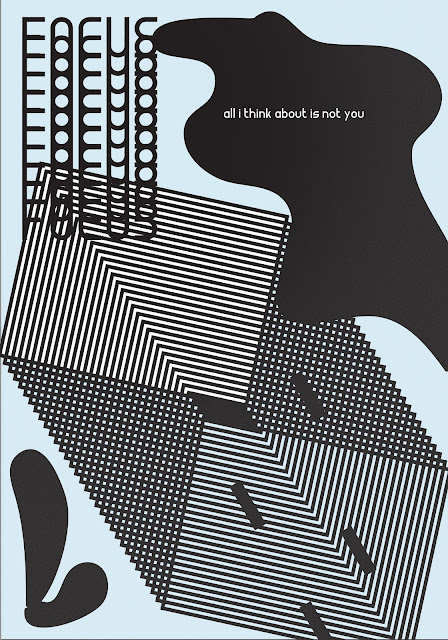
I decided that in order to express the sayings/content of each poster in a way that was appropriate I would try and divert focus within the composition. Rather than following a hierarchy of information I wanted to create 'confusion' and a more accurate representation of not being able to focus within my designs - therefore actually causing the audience to need to focus in order to fully take in the designs content.
This first design I used the idea of 'finger tips' and trying to focus on the physical over distracting thoughts. I composed the text in a way in which legibility was not a concern. I added repetitive shapes and elements of 'distraction' to visually portray this experiance of distraction within the design.
Once again this design expresses a dis-regard for legibility. I did so by manipulating the type in ways which it could not be easily read upon first glance - making the audience focus in order to read the content. I feel out of the 3 this is the most successful in doing so. The use of repetition is representative of distraction from focus.
Lastly here the same principles were used again. The hierarchy of information created by the design considerations and composition put the content at the bottom of importance. This visually represents my own experiance with lack of focus and concentration perfectly - a subversion of focus.
I used variant pastel colours within the series - I used these because pastels are very meditative and calming, informed by the state of mind I am visually aiming to portray.


No comments:
Post a Comment