I will consider the target audience in that I will attempt to take something considered to be 'boring' and 'confusing' and give it a re-freshed and appealing look. Considering trends and aesthetics that appeal directly to a younger audience and using colour theory to be bold/expressive.
Typesetting will be considered - I feel the content could be typeset in a way that is directly informed by the context of the information. Making it more visually interesting and well informed.
Print method - print method will be considered. The posterzines I looked at in my research use lithograph printers allowing them to use fluorescent inks and rgb colours. This creates a final outcome that is instantly appealing and grabs attention - I will consider print methods available to me that can create this same boldness.

This image shows the layout that my final design needs to follow.


This is an initial design for the 'cover' of the poster-zine. I was initially experimenting with a balance between photography of the iconic statues of Plato and vector/illustrative imagery representing the elements within the text (the cave, fire etc. In this example I was initially using the typeface Bluu Next - feeling that this typeface represented a piece of history being re-born and designed in a contemporary fashion.

My experiments then became more simplified. The purpose of my design is to simplify the text and deliver it in an appealing way that anyone can understand. So a simpler composition is more appropriate. I also changed the typeface to Helvetica for this reason of simplicity - Helvetica is known for not portraying any 'personality' or distracting from the content which is appropriate in this brief.

I took this design further in approaching it from a more visually bold way. I wanted to use bright colours within the design to suggest a positive and young energy that will inspire and appeal to the younger audience. The design after all is created in order to inspire.
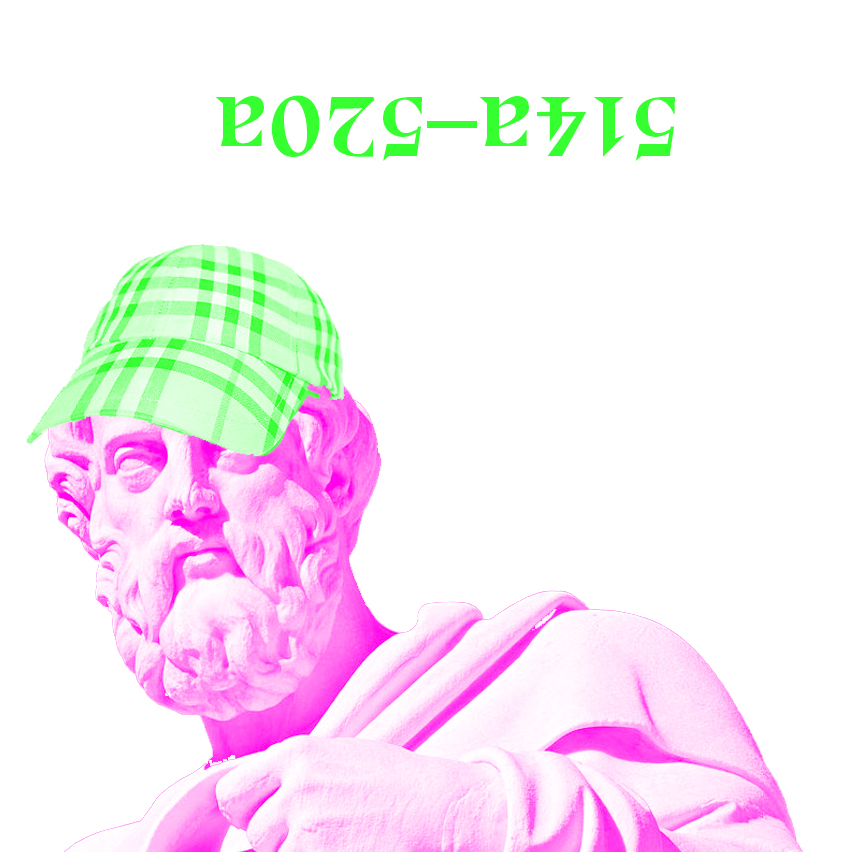
I took a comedic route in this design - adding a burberry cap on the Plato statue, I wanted a visual representation of a youth 'takeover' of philosophy. To represent how the philosophical texts from that past CAN still be applied in modern contexts.

This idea developed into something much simpler but still creating the contrast between contemporary culture and the historical reference of Plato. I took the simplicity of the helvetica type - using the title 'Beyond the fire, beyond the cave' as this is my personal re-wording of the text rather than 'the allegory of the cave'. I then used a simple image of one of the iconic Plato statues - I then felt I needed to reference contemporary visual culture specifically most popular uses within the younger age range I was targeting with my design. I did so by adding the :) the emoji is something that has completely overtaken visual culture and language becoming a very modern, newly discovered and fastly changing form of communication - in a visual format. It's used mostly by the age range of people I am aiming towards making it appropriate to the design. I felt the simple smiley was representative of me 're-masking' Plato and making the text more understandable and a positive experiance for the user/audience.

At this point I was being really experimental with colours and the final decisions would be made according to design and print method chosen.
I added some other elements to the design of the cover just to really make it my own. I wanted to portray simplicity but also elements of 'fun' to appeal to the audience. I didn't want to risk it just looking like yet another philosophy book desperately trying to be cool and down with the kids.

Next I felt like designing the main poster was appropriate to ensure consistency of design throughout each page/element of the overall posterzine. This is an initial design for the main full side poster design. I wanted to adapt the historical elements that the content of the design is based upon; and create something that appeals directly to the target audience. I kept in the same theme as the cover design - combining photographic images of Plato and digital shapes and strokes in order to show the philosophy has been edited and 'taken over' by modern context. I used letters (cave) and simple shapes that dont portray and underlying message other than the particular tone of voice and subversion effect I needed to create for a successful design.


My next step was experimenting with the contents layout, composition and typesetting. Within the initial visual research I saw examples of typesetting that was un-usual and wrapped into shapes informed by the content itself.
I experimented with some type-wrapping of the main body copy within the design. Creating shapes representative of a cave. I felt these could be successful but they worked better in terms of aesthetic rather than getting the information across with clarity. This wasn't appropriate for the brief as I wanted to get the information across in a way which was clearer than the original not more complicated.

Going forward I began to experiment with the visual elements of the posters design. I wanted the design to be content based but avoid being boring. I wanted to use bright colours and bold images to grab and more importantly keep the audiences attention.
I tried creating images using a halftone effect; this way it wouldn't limit my print production possibilities. I could digitally, screen or riso print these images in this format.
I used a large image of Plato; keeping in the general theme of sculpture images throughout for consistency in the design.
I experimented here with CMYK colours; these being the brightest I could print digitally whilst being as bold and standing out the audience as much as possible.

I finalised the layout/typesetting of the main content. Deciding to use left alignment in two columns; following 'rules of modernism' in order to produce the most easily legible way. This was of importance as the entire reasoning behind the design is to get this information out there in the simplest and most understandable form.
The image behind however I felt reduced the legibility.

I experimented with a more textural and abstract edit of one of the sculptural images I collected of Plato. This image allowed the text to be much more legible and appropriate to the concept.


These spreads show further experimentation with the placement of the second part of content (this being my personal link between the text and contemporary culture.
I experimented again with type warping into the shape of the image but felt even at a bigger pt size it still drew the audience away from the actual content and could cause confusion.

Once again I simplified this idea by using a more abstract background image allowing the text to be the most important element of the design.

Developing the poster design - at this point I had chosen to use just pure CMYK colours in order to produce the brightest design possible that could be viable when digitally printed.
This was an adaptation of the main poster design using this colour scheme.

I experimented with further variations using just the CMYK colour scheme and it's possibilites. Overlaying elements and trying different compositions with the potential addition of the yellow. In the end I decided using too many colours would over complicate things and it only really needed one or two bright eye-catching colours to be effective and still simple.

This was an initial layout design experiment combining all the elements I had previously designed part by part.


Throughout the design process I used Photoshop and the channels options to make sure that I was only using pure CMYK inks (no mixing). The channels ensured each colour would print it's own elements so the colours were pure.
The decision to simplify - I decided that I wanted to use colour in order to attract the audience - millennials are known to be easily distracted and I wanted to entice interest through the initial boldness of the design.
BUT - I felt using too many bright colours distracted from the actual context within the design. I wanted the colour to act as the thing that made the audience pick up the design initial; from then keep the design simple and let the content be the main focus of the poster. Then use the 'back' of the poster as something that could be hung and kept.
I decided on just using Pure Magenta ink, white (stock) and black for the final design treatment. These colours allow a simple yet bold aesthetic that is perfect for delivering the content in a clear way whilst still appealing to the target audience in context. The idea being they would be put on transport (like metro) and read on the go.

This is the final design for the main element of content within the posterzine - featuring the main talk through of Platos original text. I decided to use a different image for this design - one that has much more negative space allowing the content to be composed without distraction. I used a little bit of text wrapping within the texts alignment just to ensure none of the text went onto the image -avoiding distraction from the content. I continued with the halftone theme - so that I could potentially riso-print the final design.
The design is content over aesthetic, using simplicity and bold block colour to capture attention.
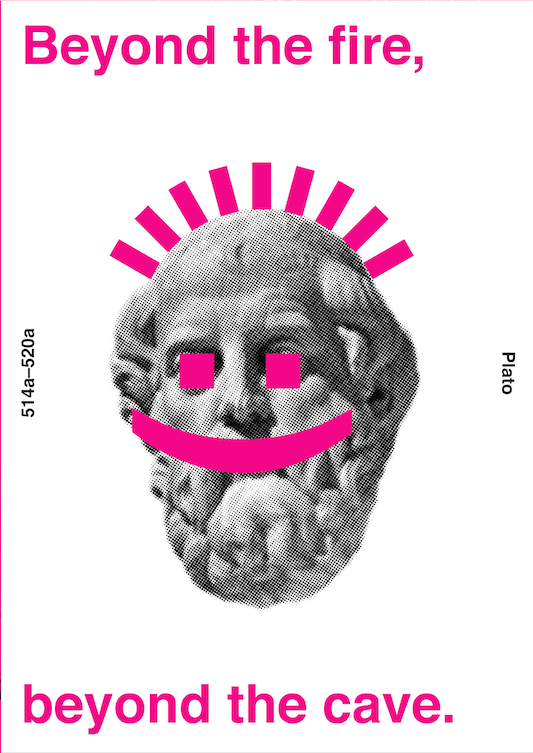
The final cover design is based around the subversion of the historical images of Plato. Using simplicity and iconography surrounding emojis (relevant to the audience). The information is all layout out in the simplest and most balanced form. Title on the top and bottom and origin of the information (514a-520a, Plato) on the sides.

The back of the posterzine (when folded) is really simple in design. I wanted to keep it traditional to standard leaflet/publication design in that it doesn't have any content - as this could be missed by the audience. Instead it features a mirror of the dates/plato from the cover design and an illustration from the original text itself depicting what 'the cave' looks like and the placement of the elements within; giving a visual description of the content within for anyone who might still have confusion about the story.

The secondary content pages are set within the initial fold of the posterzine. They are the introduction if you will. They are talking about the relevance of Platos text within contemporary culture and how it effects the way you think about things. I kept this bold, simple and 'cut out' from an abstract background created from halftone'ing and editing images of the sculptures.

Lastly the other page of the opening spread, continues to introduce the text. It takes the form of being consistent in design with the larger poster design. I kept this really minimal in consideration of the larger amount of content on this page - the more content the simpler the design. Adding the pattern elements to link back with the overall design style used throughout - making the theory visually interesting to show the content itself isn't dull.
No comments:
Post a Comment