Sunday 14 May 2017

~ Chaice Blvd - design boards ~


~ Once more with feeling - Design boards ~


~ Statement of intent - review ~

Extended practice – Statement of intent – the review – Written at the end of level 6

This is a reflective statement reviewing my initial statement of intent – and how successfully I stuck to the points made.

Point 1 – Themes – My initial plan was to take on a lot of social issue/political based briefs this year. Unfortunately, I took on a lot of live briefs that took 
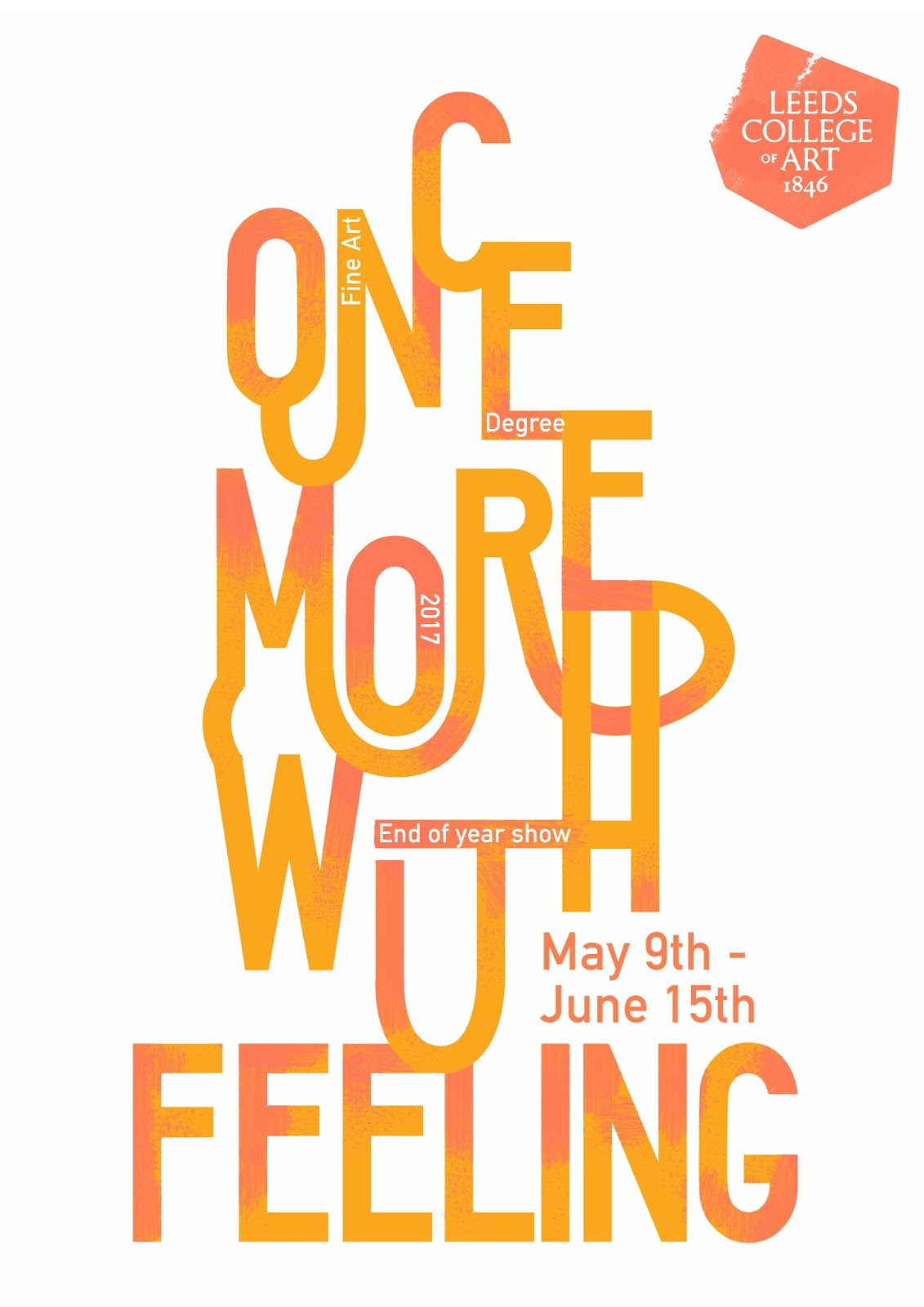
priority over more self-lead contextual briefs. However, I did engage with an exhibition branding brief that had contextual background regarding feminism and providing refuge for women. This demonstrates my interest in this area within my portfolio and was really rewarding to take part in. Engagement with social issues within context of practice also provided me with a much needed cultural hit.

Point 2 – Research process – I have been really successful this year in engaging with contextual research more than in previous years. Focusing on theoretical and contextual references to inform my designs, rather than visual inspiration, has allowed me to develop my own style. I’ve freed myself of labelling my style (modernist, post-modern, illustrative) and instead allowed context to drive the direction of each concept.

Point 3 – Documentation – In previous years I had the tendency to write a ridiculous amount of content within blog posts to the point it became more confusing than helpful. This year I’ve used my blog as a tool to record key points and notes. I have then used this to refer back to when creating concepts and design experiments. This has ensured my design decisions are informed and developed before any designing has actually taken place.

Point 4 – Visual quality – This year the visual quality of my work has vastly improved. This is due to my engagement with interesting briefs, new research methods, concise documentation and allowing myself to work freely. I have experimented more with different production methods, learnt new skills (e.g. animation) and improved existing ones. My portfolio now has an extremely positive tone of voice, a lot of branding projects which I enjoy, illustrative style and demonstrates a high level of visual competence.

Point 5 – Reflection – Reflection has been useful this year as it has helped me identity certain processes that are better than others and types of briefs that I really don’t want to engage with in the future. For instance, I took part in two very corporate branding briefs this year that didn’t allow me to have full creative freedom. This restrictive nature is something I will aim to avoid now, as the outcomes are not reflective of my style or preferred methods.


Point 6 – Brief types – I specified that I wanted to take part in collaborative briefs as a team leader in order to gain skills in project management. I wasn’t able to do so within extended practice as I was part of teams in which we had quite different ideas and styles. This did however give me a different perspective on team work and how variation in ideas can help produce something that appeals to a much bigger audience. I did also engage with a collaborative brief as part of PPP in which I executed team leadership skills and really took charge of the process, which was very enjoyable and valuable. Live briefs have been my main focus of the year, such as client lead briefs, competition briefs and creating visual responses for exhibitions. I have engaged with 14 live briefs this year, two of which are on-going and have deadlines after submission, giving me the opportunity to continue designing straight after we finish. These live briefs have taught me multiple new transferable skills that I didn’t have before. I now know the best methods of effective communication in order to get direct constructive feedback and a clear idea of client needs. I now understand the importance of time management to meet deadlines, providing print and production specifications and engage on one on one meetings with clients. The most valuable thing about this focus on live briefs is that I am now able to see my final resolutions in a real world context. This will help me identify the successful and unsuccessful elements in order to improve in the future.

~ Once more with feeling - final evaluation ~

Once More With Feeling is the title of the end of year show for fine art level 6. They have asked me to create the brand identity and poster designs for the exhibition.


These are the designs so far, the client requested I use blue and space the words further apart allowing the body copy to fit better and creating balance. 

I have suggested the final design be either screen/riso printed to get some interesting overlay effects and so we can use some bright bold inks.

Saturday 13 May 2017

~ Chaice Blvd - final evaluation ~

This is a brief I started in February as a client lead live brief. Since then I have had multiple meetings with the client and developed a basic brand identity plan. This will be expanded across the production of swing tags, web design and I will also be the art director for the product photography. 

The deadline for this brief isn't until the 23rd of July so the work is on-going. For this reason the finished product and full design process has not been recorded within the blog or submission. 

Elements I have designed/finished so far are as goes.


Animated logo design - The distorted/warped effect is to create a tone of voice appropriate to the brands personality. It's a children's streetwear/skate brand. This animation gives it an appealing and edgy look that will draw in the desired target audience.


In the same typographic style I also animated the two tag lines the client will be featuring on the actual clothing within the brand.

These will be used for the website and for promotional purposes (social media).


I have also begun design experimentation for the production of swing tags. My idea is to create 'animated tags. Made from acetate and black lines - To make it look as if the tags design is moving. This was at the clients request that i produce a tag design that really stands out and is different from your basic and boring clothing labels.

~ Once more with feeling - design development ~


I began by selecting a few different typefaces I felt could work well for this branding. I chose typefaces I felt had real individuality and weren't your everyday standard typeface people see every day. This to me is very characteristic of fine art as a discipline; they aim to produce work never been seen before, push boundaries and break rules. Overall my design needs to reflect this persona. 

My typefaces were selected from the Velvetene type foundry who specialise in the kind of typeface that stands out and never fits in with the crowd. 


My initial favourite of the typefaces was Sporting Grotesque; a very wide and extravagant typeface but in the simplest of ways. It's quirky but still bold and legible, perfect for getting the right message across. 


I began to manipulate the type; letter by letter rather than as a whole as I wanted each letter to have its own individuality and be informed by the underlying concept of 'being different'. Not just from the world but quite simply to express that fine art LCA are different from other graduates and the best in the field. 


I experimented with different typographic compositions that I felt represented the rebellious nature of fine art as a discipline. Using hand rendered textual elements (created using the digital paining tablet) to represent their main creative process. 

~ Project plan & Time Plan ~

Extended practice ~ Brief outline

1.     The Zoo Café – Live client lead branding brief – Start December 2016 – End May 2017

2.     Up Yer Sleeve – Live exhibition brief – Start March 2017 – End April 2017

3.     Starpack Health in a Hurry – Live competition brief – Start November 2016 – End April 2017 – ongoing (waiting for result)

4.     Posterheroes – Live competition brief – Start October 2016 – End November 2016

5.     Nest 10 – Live magazine feature entry brief – Start October 2016 – End November 2016

6.     Nest 11 - Live magazine feature entry brief – Start March 2017 – End April 2017

7.     Jessy Lanza – Live print exhibition brief – Start February 2017 – End March 2017

8.     James Shaw (ShawFit) Personal trainer branding – Live client lead branding brief – Start January 2017 – End March 2017

9.     Go Higher West Yorkshire – Live competition branding brief – Start November 2016 – End December 2016

10.  Framework exhibition – Live client lead branding brief – Start March 2017 – End April 2017

11.  End of year show branding – Live competition branding brief – Start February 2017 – End March/April 2017

12.  Creative networks – Live competition branding brief – Start September 2016 – End October 2016

13.  (Posters) Of a tale – Research lead brief – Start January 2017 – End May 2017

14.  Once more with feeling – Live client lead branding brief – Start April 2017 – End is ongoing June 2017


15.  Chaice Blvd – Live client lead brief – Start February 2017 – End brief is ongoing due to a timescale issue with the client


Note - projects become more frequent towards the end of the academic year due to a focus on context of practice at the beginning of the year.