
Due to the target audience of this brief being 'health conscious' individuals I felt using a recycled carton board stock would be most appropriate as health conscious people are likely to be more environmentally conscious than your average person also.
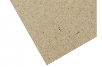

For my mockups I decided to use Carin Eco Kraft card - Its recycled and has a very speckled and obviously eco conscious appearance which appeals well to the audience. I used 280gsm so it's sturdy and folds effectively.

For the labels I decided to use a fluorescent green card - as the green I have used for the digital appearance of the brand cannot be achieved using standard CMYK laser printing, using this stock choice makes it possible to achieve this bold appearance.
The green and brown stock choices contrast well against each other and together creates an aesthetic I feel is completely individual to the brand and not alike anything else I have seen.
So I printed my nets and labels and constructed the boxes for photographing for final submission. I also used a wooden simple looking spork to show how the packaging flaps would be held together at the top.


These are the photographs taken of the final products. I decided to use props of food to show the packaging in use.


These are my final edited photos, to be sent off as part of my submission for the brief.
Overall I am really pleased with this final outcome. Each element of the design comes together really nicely. It's bold and bright aesthetic is influenced by the audience and healthy nature of the brief specifications; but comes together in a way in which it will stand out among other 'less contrasting' competitors.
The interchangeability of different box shapes and sizes allows the user/customer to completely tailor their order to exactly what they want and need; making the brand/packaging a memorable and personalised experiance. I also considered how all this variation could complicate the ordering and packing so creating a numbered system for both customer and company to use really simplifies this process. The un-usual hexagonal format of the packaging is what makes it smart in execution but also iconic among competitors - example Graze boxes. This simple yet different shape has also gone on to inform the logo design and overall simplistic geometric influenced aesthetic/brand identity.
I was unsure of how the fork handle/link would come out/work within the final design. But I am extremely happy with how effectively it holds each side of the box together tightly and you can safely hold the box with the fork handle; the thickness and durability of the stock type ensuring it wouldn't break when filled with food.
Overall i'd say simplicity and well informed design decisions is what has made this a really successful outcome. It look strong, bold and extremely memorable. It's highly functional in delivering not just a solution to the brief but other issues potential customers may have; giving them options and an interesting experiance.
No comments:
Post a Comment