
I ensured I had a constant conversation with the client; consistently showing new developments of ideas to ensure I was going in the right direction.
We finally came to the decision the logo needed to be type based; with use of the kettle bell icon alongside it and throughout the promotional branding. We also discussed typeface, in which he expressed he wanted variations of Gentona for the final design; making the most of both the regular and bold options the font family provides.

I initially experimented with creating a freeweight style visual using the W; extending the strokes into ascenders to create a logo that suggests these are arms.


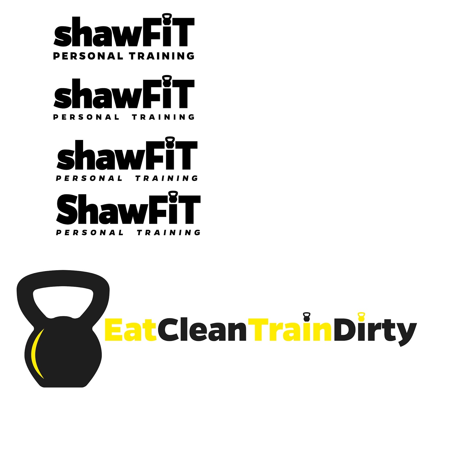
After more discussion with the client I instead decided to use the dunbell icon within the design instead. I decided to replace the dot of the i with this symbol and make the X height of the letters higher; this allows the dunbell to have more room and overall gives the logomark a better sense of balance and good form.


I experimented further with variations in form/composition of the words & also began considering how colour could be included within the design.

Alongside the logo the client wanted the fitness slogan 'eat clean train dirty' to be used along side it as part of the visual promotion. This needs to be in the same identity as the logo. I once again replaced the dots of the i's with the dunbell symbols.
I then discussed colour further with the client. He felt a dark background and yellow colour colour work well.
I decided a slightly off black background, bright and punchy yellow representative of passion and energy and clean white would work well for this branding.
I then played around with variations of the logo in terms of the weights used of the chosen typeface within the logo and the uses of capitals and lowercase.


These were my final two outcomes that I sent to the client for his final notes and changes. I used the yellow and white to breakup the logo into the two words and again on the dot barbell of the i. I sent over two variations with and without the larger symbol at the begginging to give him options.
Hi Izzie
I'm looking for designs for 2 different company logos so I can target different client types.
shawfit personal training (as before)
shaw strength and fitness
I've attached sketches for both designs.
The fonts and yellow and white lettering on dark background that you did last time are all fine. On the shawfit personal training logo I'd like to see what it looks like with the shawfit part as lowercase letters and personal training in capital letters.
For the shaw strength and fitness can you have shaw in lowercase and strength and fitness in capital letters with the letter a and the kettle bell in white. One with kettle bell before the s and one with the kettle bell after the w so I can see which looks best.
Hopefully that will be it if all looks good as I'm keen to crack on and get some biz cards and flyers printed. Let me know if any confusion.
Thanks Iz
James
These were his final notes on changes he wanted to the design.

I personally still feel the first logo here is the most effective; the use of colour breaks up the logo into the two words and generally flows well. The capitals give the logo a sense of strength and boldness needed for a fitness brand.
The other 2nd and 3rd on this image are the ones chosen by the client and he will be using for his final brand identity.
I am overall really pleased with this final outcome; the final design is bold. The thick typeface and tight kerning is representative of strength and perfectly portrays a fitness theme and the idea of gaining muscle well. The colours and extremely bold and instantly eye-catching. The symbol is simple and can be integrated throughout the logo and overall brand identity and all of the clients promotional material.
No comments:
Post a Comment