- Create illustrative posters depicting the potential textures/landscapes of planets
- Illustrate 'over' photographs taken of astronaughts
- Illustrate a large poster of an astronaught
- Consider negative space within icons or logos
- Ink illustrations of space/planets
Thursday, 30 March 2017
~ Nest 11 - Brief ~

The theme of this issue is SPACE. Interpret this how you wish, particularly if it's ~ outer space ~~ Your work could relate to distance, time, aliens, the infinite - think big!
We're looking for submissions from ALL courses, whether you're HE or FE. We also accept moving image submissions which could be featured both in print and on our social media. This a fantastic opportunity for you to get your work featured in a high quality publication that is distributed both nationally and internationally.
The deadline is now FRIDAY 31st MARCH
Please send submissions as a 300dpi pdf to editorial@students.leeds-art.
Please note that all work submitted will be published with credits on the NEST website or instagram, unless you tell me otherwise! If you have any questions or want to show me your work just send me an email or find me around college!
Wednesday, 22 March 2017
~ Chaice Blvd - First client meeting ~
Initial client meeting and feedback
Notes
- No colour, black & white and super minimal
- Type only logo needed and a symbol
- Wants to keep the same typeface as the existing branding but just play around with making it more individual to the brand - Haetten Schweiler
- She liked bitmap/pixel style design for potential symbol logos

- Mid April the new collection will be complete and ready to put on the website - potential to art direct and style the photoshoot
- Look at Caroline Bosmans - she produces the kind of thing the client aims for


The clients clothing collections will be very similar to ADER - very simple embroidered type on various clothing items with words and sayings. The branding and art direction all needs to fit this style well.
Also consider Japanese style design as its also appealing to the clients fashion.
- Consider interesting stock choices for the swing tags
- Potential for promotional videos to be produced using an old school film effect?
- Likes text message font/boxes
Notes
- No colour, black & white and super minimal
- Type only logo needed and a symbol
- Wants to keep the same typeface as the existing branding but just play around with making it more individual to the brand - Haetten Schweiler
- She liked bitmap/pixel style design for potential symbol logos
- The summer collection is all white
- Winter collection will be all black
- Slogan 1 - 'Don't forget to play'
- Slogan 2 - 'No ball games' with No struck through
- She needs the design for swing tags and stickers making (top priority)
- Likes transluscent iridescent stock - could be used like tissue paper to help package the products. - Iridescent celophane
- Mid April the new collection will be complete and ready to put on the website - potential to art direct and style the photoshoot
- Look at Caroline Bosmans - she produces the kind of thing the client aims for


- Also see ADER, Palace and Vetements


Also consider Japanese style design as its also appealing to the clients fashion.
- Consider interesting stock choices for the swing tags
- Potential for promotional videos to be produced using an old school film effect?
- Likes text message font/boxes
~ Chaice Blvd - Initial design ideas ~
The client requested I come up with some initial ideas and potential directions to take with the brand so we could discuss them in person. Keeping in mind the things she has mentioned in the initially brief this is what I came up with.
She mentioned she wanted something mainly type orientated - type only logo and a potential logo mark that could be used alongside this.


 This is my presentation to take to my first meeting with the client. Starting with the two slides on the potential logo directions and the colour theory.


 I then created additional slides mocking up the logos & identity onto potential collateral and fashion based elements to give her an idea of what they could look like in real life application.

She mentioned she wanted something mainly type orientated - type only logo and a potential logo mark that could be used alongside this.

I started by trying out some potential typefaces that could be used - I wanted something individual and iconic that could set the brand apart - I went for typefaces that have blackletter/calligraphy influences as I feel these look individual and are iconic of street brand fashion which the client expressed an interest in.

I experimented with the addition of a coat-hanger as its a minimal symbol but iconic of clothing.

I experimented further and felt the best fit in terms of typeface was BLUU NEXT as this is simple yet has various quirks that makes it really individual in appearance. I then began experimenting with creating a monogram type symbol logo out of the C & B.

This is the final logo I produced. The type stands alone well and the individual looking typeface makes it bold and iconic. The monogram is simple, legible and well executed.

I chose to present these initial ideas in a pastel green - the client said she wanted black and white but I decided to pitch that light green was still minimal and a very gender neutral colour.

I created various compositions of the logo so when meeting the client she could tell me which direction she felt was most appropriate - to give me a full idea of what she likes and hates.

I presented the potential to use black/white, pastel green - and also marble textures as I feel they are representative of high class fashion which is what the client wants to portray with her brand identity.


Lastly - The client told me she really wanted to produce a tag design that stood out and would be an iconic part of the brand - making receiving the clothing a memorable experiance and possibly making something the buyer would actually keep.
This slide includes visual examples of directions I could take with the label production...
- Scratch card
- Wax seal
- Perspex
- Lazer cut
- Metallic board
- Bubble foil stock
- Spray paint
- Small packet including badges and labels
Monday, 20 March 2017
~ Starpack - Label design ~
So far I have my logo/general fluorescent green and minimal design aesthetic set for this brief and have my base layer packaging nets ready to be printed onto the recycled brown carton board.
Alongside this I need to now design the labels and other elements which will be incorporated within the packaging to make it complete. This includes...
- An order form
- Labels for the outside of the box
- Labels for each individual order (numbered in the style of an 'oldschool' Chinese takeaway ordering system'
- Refer a friend, offer voucher?


This is the front and back design for the order form that will be part of the packaging. This is designed to ensure the people packing/delivering the food know exactly what order it is and to ensure the customer the correct order has been delivered.
The front will include the order number, a list of the items included (with their numbers) and the logo. The back will be for the purpose of the packers/workers; it shows a map of the packaging with the corresponding orders/elements chosen by the customer. It lets the packers know what dish needs to be in what size packaging and where it needs to be placed within the outer box. When then placed into the completed order it lets the customer know which dish is which within the order.

This shows firstly the individual strip labels which will go onto each box; corresponding number to the meal type/order. Also a voucher which will be placed into all orders; each voucher has a code offering a friend of the customer half price off their first few boxes; when the voucher is used the original customer also gets a discount. It's a smart way of ensuring happy customers want to refer their friends and share the brand with others for mutual benefit.

Lastly I have created a sheet with some variations of logos/stickers for the outside of the box. I will choose which looks most appropriate and fits the overall box once printed.
~ Starpack - Revisiting the brief ~
- Brief D: Health in a Hurry
Sponsored by Graphic Packaging International
Create a solution, using cartonboard as the primary packaging material, to deliver fresh meals, snacks and drinks to health-conscious consumers' homes and workplaces in 90 minutes or less.
Create a solution, using cartonboard as the primary packaging material, to deliver fresh meals, snacks and drinks to health-conscious consumers' homes and workplaces in 90 minutes or less.

I feel my solution and concept is really well considered and fits well as the concept gives the audience lots of options when it comes to portions, foods, meals snacks, drinks etc. In comparison to competitors who's packaging often limit the consumer to specific sizes of meal and often just the option of one meal per order rather than a selection of a few different courses.
~ The zoo - Typeface exploration ~
I know this brand identity needs to have a real personal feel to it as the cafe acts as a hub within the community and is really driven by these values. It is also vegetarian and needs to express this 'earth loving' nature throughout the branding.
I collected some potential examples of typefaces I feel express this hand-crafted community spirit I am after portaying visually.


I created the name in each typeface to be used as a reference so once I have designed the logo I can then choose which typeface looks best with the logo. As they all represent the aesthetic and personality needed.
~ The Zoo - branding research ~
In preparation to create a brand identity for Zoo I wanted to research similar examples of cafes/restaurants branding for inspiration and to see what works well.


In a society where most interactions are rather removed from each other and the digital age separates us: the cafe/restaurant/bar serves an important role of bringing us together. This makes it important and effective to create a logo that seems welcoming, friendly and personal.
The Zoo aims to be a community hub not just a place to eat and the branding needs to set it apart from chain restaurants. I collected some logo examples showing a friendly and hand rendered yet professional aesthetic. Using type and illustration that isn't clean cut and perfect instantly gives personality to the design allowing the audience to connect on a more personal level; as opposed to clean cut chain restaurants branding.
I will consider techniques such as;
- Textures
- Hand drawn style typography
- Illustrative logo
- Pattern
- Hand rendered elements
Within the final design treatment to create this personality and connected edge to help promote the business as a cultural hub within the city where people can connect.


I explored some contemporary examples of restaurant branding and use of colour theory that I found gave off the vibrant & accessible tone of voice I was after.
I want to create a brand identity that feels home grown, community driven and really personal. The use of calm, friendly and neutral colours and possibly a focus on a hand rendered or 'rustik' style of design could help create this.
~ Personal trainer branding - Final logo development ~

I ensured I had a constant conversation with the client; consistently showing new developments of ideas to ensure I was going in the right direction.
We finally came to the decision the logo needed to be type based; with use of the kettle bell icon alongside it and throughout the promotional branding. We also discussed typeface, in which he expressed he wanted variations of Gentona for the final design; making the most of both the regular and bold options the font family provides.

I initially experimented with creating a freeweight style visual using the W; extending the strokes into ascenders to create a logo that suggests these are arms.


After more discussion with the client I instead decided to use the dunbell icon within the design instead. I decided to replace the dot of the i with this symbol and make the X height of the letters higher; this allows the dunbell to have more room and overall gives the logomark a better sense of balance and good form.


I experimented further with variations in form/composition of the words & also began considering how colour could be included within the design.

Alongside the logo the client wanted the fitness slogan 'eat clean train dirty' to be used along side it as part of the visual promotion. This needs to be in the same identity as the logo. I once again replaced the dots of the i's with the dunbell symbols.
I then discussed colour further with the client. He felt a dark background and yellow colour colour work well.
I decided a slightly off black background, bright and punchy yellow representative of passion and energy and clean white would work well for this branding.
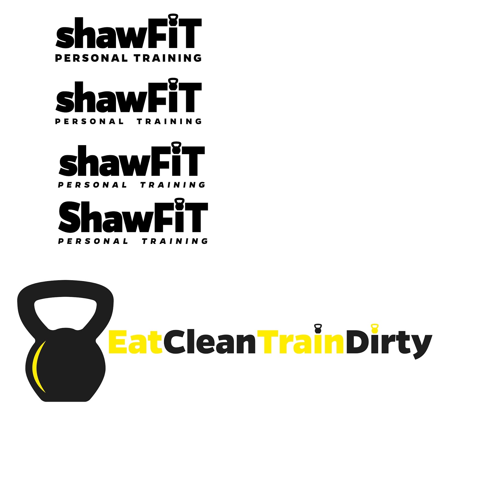
I then played around with variations of the logo in terms of the weights used of the chosen typeface within the logo and the uses of capitals and lowercase.


These were my final two outcomes that I sent to the client for his final notes and changes. I used the yellow and white to breakup the logo into the two words and again on the dot barbell of the i. I sent over two variations with and without the larger symbol at the begginging to give him options.
Hi Izzie
I'm looking for designs for 2 different company logos so I can target different client types.
shawfit personal training (as before)
shaw strength and fitness
I've attached sketches for both designs.
The fonts and yellow and white lettering on dark background that you did last time are all fine. On the shawfit personal training logo I'd like to see what it looks like with the shawfit part as lowercase letters and personal training in capital letters.
For the shaw strength and fitness can you have shaw in lowercase and strength and fitness in capital letters with the letter a and the kettle bell in white. One with kettle bell before the s and one with the kettle bell after the w so I can see which looks best.
Hopefully that will be it if all looks good as I'm keen to crack on and get some biz cards and flyers printed. Let me know if any confusion.
Thanks Iz
James
These were his final notes on changes he wanted to the design.

I personally still feel the first logo here is the most effective; the use of colour breaks up the logo into the two words and generally flows well. The capitals give the logo a sense of strength and boldness needed for a fitness brand.
The other 2nd and 3rd on this image are the ones chosen by the client and he will be using for his final brand identity.
I am overall really pleased with this final outcome; the final design is bold. The thick typeface and tight kerning is representative of strength and perfectly portrays a fitness theme and the idea of gaining muscle well. The colours and extremely bold and instantly eye-catching. The symbol is simple and can be integrated throughout the logo and overall brand identity and all of the clients promotional material.
Subscribe to:
Comments (Atom)