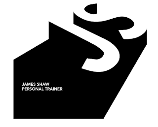
The client wanted me to experiment with names for his business alongside the branding, which left it really open to interpretation. I felt it was most appropriate to start with experimentation purely using his name.
I used my research into different styles of logo design as a point of reference for experimentation. I began with trying out some monogram styles, J&S proved to be difficult letters to incorporate within one and other.
These were the final outcomes; I chose to create a sans serif monogram as I feel bold, clean cut sans serif typefaces are more iconic of fitness. Unfortunately this style of type doesn't look very effective when used for a monogram.
Next I decided to experiment with some symbolism surrounding fitness and personal training. The main I felt being free-weights. I created this simple negative space design; but I felt it's lack of 'multiple meaning' made it too simple and not eye-catching enough as a finished logo.
My next step was combining the two previous ideas; trying to produce a design using the initials and symbolism of the free-weights. I couldn't find a way of combining the two effectively.
Experimentation and decisions regarding typeface - I felt the most effective type used for this would be all-uppercase as this is representative of strength and boldness. A bold/heavy version of a typeface also portrays this; or a condensed version.
This is a simple version of the monogram within a circle. I felt this was too delicate and not representative of strength enough.
I then created something 'opposite' of the previous design. Using sharp box shapes, a bolder typeface and additional symbolism of weights (again using a negative space theme).
This logo is a combination of the simple negative space imagery and the bold simplicity of the strong badge shape.
Further experimentation with the negative space symbolism of the weights. But once again I felt a focus on curves and smooth lines wasn't as direct and informed by the context as it should be.
Discussion with the client lead to him discussing the idea of simplicity and 'boxes'. So these are just some simple explorations of this idea.
A monogram experiment using the weight symbol within the negative space of the S.
Monogram trying to communicate/visualise speed and movement.
Simple experiments using negative space.
At this point I felt my creativity and ideas were warmed up but I needed much more sense of direction from the client. So I showed him the design experiments created so far to get more direction and feedback in order to find a final idea to run with.


No comments:
Post a Comment