I was sure that a logo would be most successful when using word/visual play with the idea of 'going higher' and using the icon of an arrow.

This initial experiment shows a design creating the arrow/more of a triangle shape out of individual hands/arms. I wanted it to be representative of togetherness, academic support and the arrow symbol.

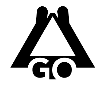

I developed this further into creating a similar adaptation showing two hands meeting in the middle - representative of togetherness and reaching higher for your goals. I then used the base/stem of the arrow to incorprate the GO within the negative space.

I further developed this concept and decided due to its educational and proffessional context the logo needed to be simpler and straight forward in its execution. I simplifed the concept and created an arrow symbolic of the name and intergrated the negative space GO within. Allowing for experimentation regarding the placement of the other type.
Typeface - For the typeface used within the design and proposed brand identity I chose the Avenir family. Avenir is simple, legible and bold - easily representative of a proffessional and educational company. It is also available in multiple widths/varients giving the client lots of options regarding further design options - web design, promotion etc. could use multiple weights to express information hierarchy.

For the remaining type positioning I once again went for simplicity and placed them below the main body of the logo design. I made the most of the typefaces varients and used Avernir heavy for the upper line and Avenir medium for the lower to create a hierarchy of type and an equal balence within each layer of the logos design. I create a positive and negative version of the logo; each could be more appropriate for certain types of media/backgrounds and used in interaction with one and other.

I also created an elongated version of the logo but couldnt decide which was most effective?

Colour theory - Alongside the logo design the competition asks for an overall brand identity including colour choices. After much experimentation with colour choices/varying tones I decided on...
Orange - Representative of positivity, happiness, drive, friendly
Blue - Corperate, educational, proffessional
I felt two colours in conjunction with each other was most appropriate as although the logo needs to express the educational tone it also needs to be friendly and approachable to potential students wanting to get involved. The combination of the two gives off this message perfectly.
CRIT

The overall opinion was the shorter arrow design was most effective as it could be fit perfectly within a square box which is more pleasing to the eye.
They felt the colour choices (lighter orange) were well informed and worked well for the brand.
No comments:
Post a Comment