Saturday 31 December 2016

~ Go higher west yorkshire - final evaluation & time plan ~


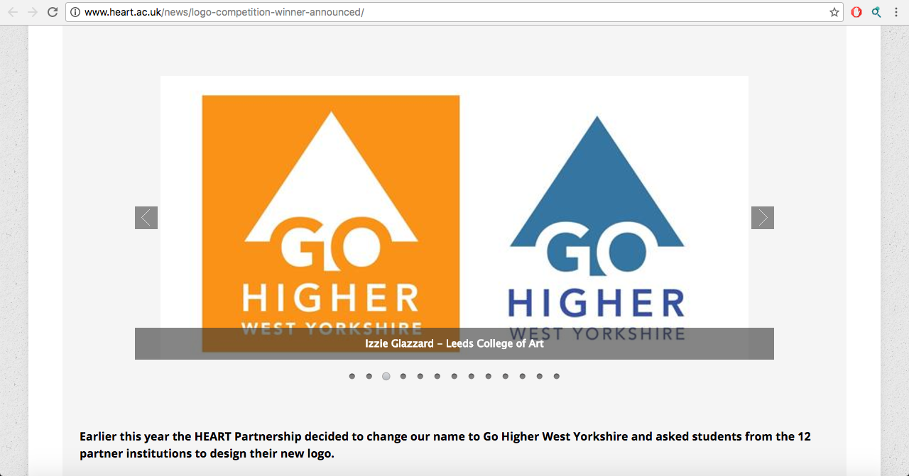
This was a live brief aimed at students of the universities within the 'Go Higher' collective. They wanted a new logo design and brand identity to go with their name change. This exclusivity was good as it gave me a good chance of getting exposure. I came runner up in this competition and my logo design/name was published on their website. This was brilliant real life publicity for my practice making this brief really beneficial. 

Despite the positivity of being chosen as a runner up I didn't particularly enjoy this brief. For me it didn't have much creative freedom - party because the final outcomes were all specifically outlined and it was mainly about the logo design. The tone of voice needed was very professional and corporate and this isn't the way I like to design. But learning this early on in the year was good as I chose briefs that were less serious and had more room for creativity following this. 

I do however feel the logo design (and identity) was successful. It was well considered and executed and shows my skills in this area of design. Even though I didn't find it enjoyable it shows future employers I am able to effectively work this way and within tight constraints. 

The timescale for this brief was small but this wasn't an issue for me as all of the contextual research needed was provided via the website; and the amount of final designs needed was small. I completed everything promptly. It has shown me the value of taking on small branding briefs even if they aren't the most creative as they can be a quick and straight forward process/path into finding the most appropriate treatment - unlike briefs with more creative freedom which involve a lot more options and considerations. 

Time plan

November - Brief, contextual and visual research, ideas process, design experiments
December - Logo design, collateral design, submission

Friday 30 December 2016

~ Go Higher - Result ~


A positive result for the Go Higher branding. Although I did not win I came runner up, my work was published on their website and I reccived a gift voucher. 


The work has also been published onto my online Behance portfolio.

https://www.behance.net/gallery/48494017/Go-Higher-West-Yorkshire-Branding


Monday 5 December 2016

~ Go Higher - final submission ~


Alongside the basic logo design the brief asked me to design some basic letterheads and a website design mock-up showing how the brand identity would translate further.


I experimented with some potential layouts for the letterheads - once again coming to the conclusion that simplicity would translate a proffessional yet approachable tone of voice in the best way. Using bold type choices and vibrant colours to express such.


Logo placed in the top left hand corner - signifies proffessionalism as its the standard way of displaying yourself within a letterhead. The orange corner uses the angle of the arrow to add a splash of colour. And bold type on the bottom - to finish.


Bright, simple and eyecatching to the reader.

The final letterhead designs are clean, clear and bright. It's double sided so nomatter where it is placed it cannot be forgotten and ignored because the bright orange will draw in the eye.


Also within the brief requirements was to produce a simple web mock-up to show how the brand identity would translate digitally. I designed a minimal layout using the colours and logo. Expressing how the minimal overall brand would create a clean and eaisily navigable website design.

DESCRIPTION

The logo is a visual adaptation of 'go higher'. The arrow is symbolic of raising potential and going higher through education. The negative space adaptation of the icon and logotype creates an effective coherence between the two. The typeface Avenir was chosen for clarity, legibility and ease of use. The colours were chosen to reflect both learning & professionalism and positivity & creativity. The design is simple and can be effectively adapted to both a professional and student audience as demonstrated by the website and letterhead mock-ups. All aesthetics, layouts, colours etc. can be easily modified accordingly. 


Saturday 3 December 2016

~ Go Higher - logo design ~

I was sure that a logo would be most successful when using word/visual play with the idea of 'going higher' and using the icon of an arrow. 

This initial experiment shows a design creating the arrow/more of a triangle shape out of individual hands/arms. I wanted it to be representative of togetherness, academic support and the arrow symbol.


I developed this further into creating a similar adaptation showing two hands meeting in the middle - representative of togetherness and reaching higher for your goals. I then used the base/stem of the arrow to incorprate the GO within the negative space.


I further developed this concept and decided due to its educational and proffessional context the logo needed to be simpler and straight forward in its execution. I simplifed the concept and created an arrow symbolic of the name and intergrated the negative space GO within. Allowing for experimentation regarding the placement of the other type. 

Typeface - For the typeface used within the design and proposed brand identity I chose the Avenir family. Avenir is simple, legible and bold - easily representative of a proffessional and educational company. It is also available in multiple widths/varients giving the client lots of options regarding further design options - web design, promotion etc. could use multiple weights to express information hierarchy.


For the remaining type positioning I once again went for simplicity and placed them below the main body of the logo design. I made the most of the typefaces varients and used Avernir heavy for the upper line and Avenir medium for the lower to create a hierarchy of type and an equal balence within each layer of the logos design. I create a positive and negative version of the logo; each could be more appropriate for certain types of media/backgrounds and used in interaction with one and other.


I also created an elongated version of the logo but couldnt decide which was most effective?

Colour theory - Alongside the logo design the competition asks for an overall brand identity including colour choices. After much experimentation with colour choices/varying tones I decided on...

Orange - Representative of positivity, happiness, drive, friendly

Blue - Corperate, educational, proffessional

I felt two colours in conjunction with each other was most appropriate as although the logo needs to express the educational tone it also needs to be friendly and approachable to potential students wanting to get involved. The combination of the two gives off this message perfectly.


CRIT


In the crit I was just looking to make some final touches and descisions on colour and the logos final design.

The overall opinion was the shorter arrow design was most effective as it could be fit perfectly within a square box which is more pleasing to the eye.

They felt the colour choices (lighter orange) were well informed and worked well for the brand.

Thursday 1 December 2016

~ Go Higher West Yorkshire - Research & idea generation ~

http://www.heart.ac.uk/

Go Higher West Yorkshire is a company that helps individuals study access courses in order to get into university in Yorkshire (and the partnering universities within Yorkshire).

Due to its professional, educational and corporate nature the logo design needs to portray this. Through a clean cut, simple, professional - yet friendly & approachable design.

I collected some examples of educational themed logo designs to collect symbols and icons that are related to the sector and to develop an idea of a successful tone of voice. 


Symbolism related to education include -

- Pens/pencils
- Graduation caps
- Globe
- Books
- Flags
- Buildings (schools)
- Simple, bold & approachable sans serif type
- Bright & positive colours

Other icons related to the name include

- Access (doors?)
- Arrows - to show going up/higher
- West Yorkshire (symbols of Yorkshire)